App Development
Mobile Accessibility Release Tests: Large Text, Screen Readers, and Dynamic States
Review complete mobile tasks with enlarged text, meaningful accessibility labels, predictable focus, and careful AI assistance.

Web Development
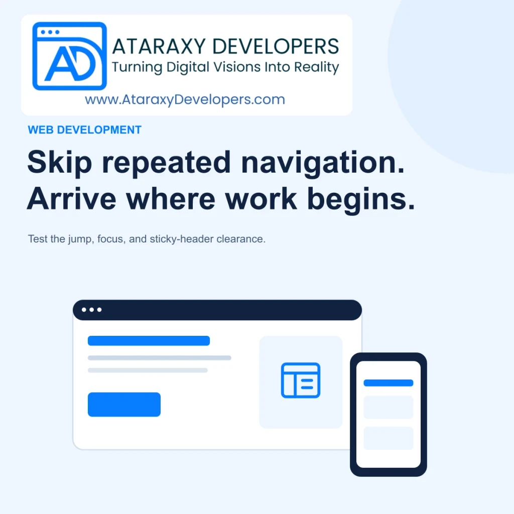
Review website skip links as a complete keyboard journey: visible entry, a stable main-content target, usable focus, and clearance beneath sticky headers.
LET’S BUILD SOMETHING USEFUL
Talk to Ataraxy Developers about your website, app, or custom software.
A visitor who browses several service pages should not have to step through the same navigation menu before reaching every article. A skip link offers a direct route to the main content. Its value depends on what happens after activation: the page must move to a useful place, the next keyboard action must continue there, and a sticky header must not cover the destination.
This is a small feature with several moving parts. A link can appear correct in a screenshot while failing during actual keyboard use. Review the complete journey on representative pages, including the longest header, a narrow display, and a page whose content arrives after the initial response. The following workflow turns that review into a repeatable release check.
Start with one sentence describing what the visitor should reach. On a service article, that might be the article heading and introductory text. On a product comparison page, it might be the comparison section rather than a promotional banner. Choose a stable main-content container with a unique identifier. A link to an identifier that appears twice creates ambiguity before any accessibility testing begins.
The W3C skip-link technique describes a first interactive link that bypasses repeated material and moves focus to the main content. Treat this as a useful implementation pattern, while remembering that a technique is not the entire accessibility standard. A meaningful label such as “Skip to main content” explains the action more clearly than “Skip” alone.
Map the destination across templates. A landing page, blog article, search results page, and authenticated dashboard may need different main-content boundaries. Keep the label consistent when the action is consistent. If a complex application offers several skip destinations, name each destination plainly and verify that the extra choices actually reduce effort.
Place the link early in document order and test from a fresh page load using only the keyboard. The first relevant focus stop should reveal it. A focus-only design needs enough contrast, padding, and stacking priority to remain readable above the header. Hiding the link with a technique that also removes it from keyboard navigation defeats its purpose.
Review both the normal and focused appearance. A design that moves an off-screen link into view should not leave a tiny clipped fragment at the edge of the page. Its focus outline should remain visible against the surrounding background. Check the link with increased text size, because a short label in the default language may wrap into two lines after translation.
For example, a consultancy header may contain a logo, six service links, a language switch, and a contact button. The skip link should provide a clear way past that repeated group. It should not open a menu or require another decision before reaching the page’s unique material. Keep its interaction as direct as its label promises.
Activate the link, then press Tab again. Observe where focus goes rather than assuming that a visible scroll proves success. The next control should belong to the main content or follow it logically. If focus returns to the header, the visual movement has hidden an incomplete implementation. Test reverse navigation as well, so users can deliberately return to earlier controls.
A noninteractive destination may need an appropriate focus strategy for the browsers and assistive technologies you support. A programmatically focusable target can be useful, but avoid adding every heading to the ordinary Tab sequence. Extra focus stops make the page harder to navigate. Prefer the simplest native anchor behavior that works, adding script only where testing demonstrates a real need.
Record the active element, the visible destination, and the next focus stop in a short test note. These three observations help engineers distinguish an incorrect anchor, a focus-management issue, and a layout obstruction. A screen recording is helpful when a route transition or delayed component unexpectedly moves focus after the initial jump.
A fixed header can cover the heading that an anchor brings to the top of the viewport. The problem often appears only after a notification banner is added, a navigation label wraps, or a user enlarges text. Test the largest realistic header rather than relying on its default desktop height. A hardcoded offset may work today and fail after an ordinary content edit.
CSS offers ways to reserve scrolling clearance. The MDN reference for scroll-margin-top explains the property used to adjust a target’s scroll margin. Choose offsets as part of the layout system and verify their actual effect. They do not replace checking focus, and a nested scrolling container can behave differently from the page itself.
The W3C explanation of focus not obscured identifies sticky headers and footers as potential obstructions. For practical design review, aim to keep the destination and focused control fully readable. A floating chat widget or consent panel deserves the same attention as the header.
Client-side routing can replace the main region after the link has already targeted it. Keep the destination identifier stable and ensure the element exists when the link is available. If a skeleton occupies the main region, do not discard the user’s position when real content arrives. Navigation should have a documented focus policy that works with the skip link rather than competing with it.
Test slow rendering by delaying the content request. Activate the skip link before the request completes, then continue navigating when the content appears. The user should not be thrown back to the top or left on an element that has been removed. Also test a failed request: the error message and recovery control still belong in the reachable main region.
Avoid unnecessary smooth scrolling for this utility. A quick jump is often easier to understand, especially when the destination is far down the page. If animation remains part of the implementation, respect motion preferences and verify that focus becomes useful immediately. The interaction should not depend on watching a transition finish.
Use a small matrix covering desktop keyboard navigation, a narrow viewport, enlarged text, and the supported screen-reader/browser combination. Include at least one long page and one page with delayed content. For each case, record whether the link becomes visible, whether its destination exists once, whether focus moves usefully, and whether the next control remains visible.
Automated checks can catch a missing target or duplicate identifier. They cannot fully establish whether the resulting journey makes sense. AI assistance can draft template inventories or suggest edge cases, but a reviewer must perform the actual interaction. Keep the acceptance record attached to the shared header component so later redesigns inherit the same expectations.
A reliable skip link joins a clear entry point to a useful destination and a predictable next keyboard action. Review those outcomes together, including sticky layers and delayed rendering. Once the behavior is verified across templates, keep the check in the shared navigation release process so ordinary design changes do not quietly reintroduce repeated effort.
LET’S BUILD SOMETHING USEFUL
Talk to Ataraxy Developers about your website, app, or custom software.
KEEP EXPLORING
Review complete mobile tasks with enlarged text, meaningful accessibility labels, predictable focus, and careful AI assistance.

Build useful modal dialogs with deliberate focus, clear dismissal, accessible errors, and a reliable return to the surrounding page.

Design accessible comparison tables with useful headers, readable mobile layouts, clear sorting, and AI summaries that preserve the underlying facts.