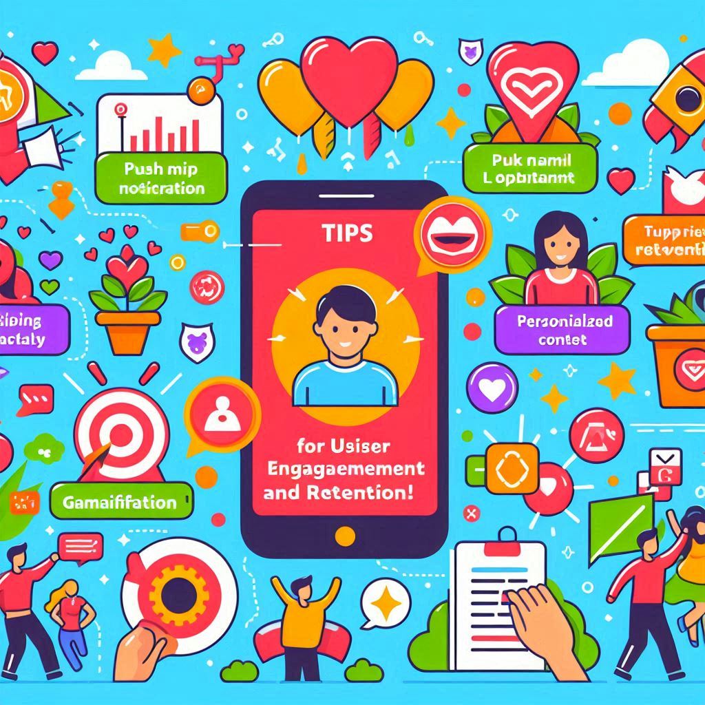
How to Keep Users Engaged: Tips for Retention In today’s competitive app market, user engagement is crucial for long-term success. While acquiring new users is important, retaining existing ones is even more vital. Research shows that acquiring a new customer can cost five times more than retaining an existing one, making user retention a priority for app developers and businesses alike. This blog will explore effective strategies to keep users engaged with your app and improve retention rates. From personalized experiences to gamification techniques, these tips will help you build a loyal user base and foster lasting relationships with your audience. 1. Understand Your Users To keep users engaged, it’s essential to understand their needs, preferences, and behaviors. By gathering insights about your users, you can tailor your app experience to meet their expectations. a. Conduct User Research Invest time in conducting surveys, interviews, and usability tests to gain valuable feedback from your users. Understanding their pain points, motivations, and usage patterns will help you create features that resonate with them. b. Utilize Analytics Tools Analytics tools can provide valuable data on user behavior within your app. Track metrics such as session duration, feature usage, and user demographics to identify trends and areas for improvement. Use this data to refine your app’s design and functionality. 2. Personalize the User Experience Personalization is a powerful tool for enhancing user engagement. By delivering tailored experiences, you can make users feel valued and understood, encouraging them to return to your app. a. Dynamic Content Recommendations Use algorithms to analyze user behavior and preferences, allowing you to recommend relevant content or features. For example, if your app is a fitness tracker, suggest workouts based on the user’s previous activities and goals. b. Customized Notifications Send personalized push notifications to keep users informed about updates, offers, or features that align with their interests. Avoid generic messages; instead, tailor notifications to specific user segments for better engagement. 3. Incorporate Gamification Elements Gamification can significantly enhance user engagement by adding fun and rewarding elements to your app. By incorporating game-like features, you can motivate users to interact with your app more frequently. a. Rewards and Incentives Implement a rewards system that encourages users to complete tasks or achieve milestones. This could include points, badges, or discounts. Users are more likely to stay engaged when they feel they are making progress and being rewarded for their efforts. b. Leaderboards and Challenges Introduce leaderboards or challenges that allow users to compete against one another. This not only fosters a sense of community but also encourages users to engage more with your app to improve their rankings. 4. Foster Community and Social Interaction Creating a sense of community within your app can significantly boost user engagement. By allowing users to connect, share experiences, and interact with one another, you can foster loyalty and keep users coming back. a. In-App Social Features Consider adding social features that enable users to connect with others, such as commenting, sharing, or messaging functionalities. For example, a cooking app could allow users to share their favorite recipes and tips, creating a vibrant community. b. User-Generated Content Encourage users to contribute content, such as reviews, testimonials, or photos. User-generated content not only adds authenticity to your app but also creates a sense of belonging among users, encouraging them to engage with the app regularly. 5. Provide Continuous Value To keep users engaged, your app must consistently deliver value. Regularly update your app with new features, content, or improvements that meet user needs and expectations. a. Regular Updates and Enhancements Stay responsive to user feedback and continuously improve your app. Regular updates that address user concerns or introduce new features demonstrate that you care about your users’ experiences and are committed to enhancing their engagement. b. Educational Content and Resources Provide users with valuable resources, such as tutorials, articles, or tips, that enhance their experience with your app. For instance, if your app focuses on personal finance, consider offering articles on budgeting strategies or investment tips to keep users engaged and informed. 6. Utilize Effective Onboarding Processes A smooth onboarding process is crucial for user retention. A well-designed onboarding experience helps users understand how to navigate your app and utilize its features effectively. a. Guided Tours and Tutorials Introduce new users to your app with guided tours or interactive tutorials. Show them key features and functionalities, ensuring they feel comfortable using the app from the start. b. Progress Tracking Incorporate progress tracking during onboarding to help users visualize their journey within the app. This not only keeps users engaged but also motivates them to explore more features as they see their progress. 7. Encourage Regular Interaction Creating opportunities for users to interact with your app regularly is vital for retention. Use strategies that encourage users to come back frequently. a. Daily Challenges or Tasks Introduce daily challenges or tasks that users can complete to keep them engaged. This could involve setting a daily goal or encouraging users to check in regularly. b. Time-Limited Offers Implement time-limited offers or promotions to encourage users to engage with your app within a specific timeframe. This sense of urgency can motivate users to take action and return to your app. 8. Collect Feedback and Act on It User feedback is invaluable for improving engagement and retention. By actively seeking input from your users and acting on their suggestions, you can create a more user-friendly experience. a. Feedback Forms and Surveys Incorporate feedback forms or surveys within your app to gather insights from users. Ask them about their experiences, features they love, and areas they feel could be improved. b. Respond to User Feedback Show users that their feedback matters by addressing their concerns and implementing changes based on their suggestions. This not only improves the user experience but also fosters loyalty and engagement. Conclusion Keeping users engaged and retaining them in a competitive app landscape requires a thoughtful approach. By understanding your users, personalizing their experiences, incorporating gamification, and fostering

Best Practices for Mobile App Design
Best Practices for Mobile App Design In today’s fast-paced digital landscape, mobile app design plays a crucial role in determining the success or failure of an app. With millions of apps competing for user attention, delivering a seamless and visually appealing user experience (UX) is essential. A well-designed app not only ensures user satisfaction but also drives engagement, retention, and ultimately, business success. This blog covers the best practices for mobile app design, focusing on creating intuitive, user-friendly, and visually engaging apps that meet both user needs and business goals. 1. Prioritize User-Centered Design The cornerstone of any successful mobile app is user-centered design (UCD), which focuses on the needs, expectations, and behaviors of the target audience. Your app’s design should be built around providing value to the user, making it easy for them to navigate and complete tasks. Key aspects of user-centered design include: User Research: Conduct research to understand the preferences, pain points, and habits of your target users. This data will guide design decisions and ensure that your app solves real user problems. Personas: Create user personas to represent different segments of your audience. By designing with specific personas in mind, you can create a more personalized and relevant user experience. Usability Testing: Continuously test your app with real users to identify usability issues. Testing helps uncover any design flaws or pain points early in the process, allowing you to make improvements before launch. 2. Focus on Simplicity and Minimalism When it comes to mobile app design, simplicity is key. Mobile users are often on the go and have limited attention spans, so your app should be easy to navigate, with a clear focus on its core functions. Here’s how to achieve simplicity and minimalism: Remove Clutter: Avoid overcrowding the screen with too many elements. Focus on essential features and eliminate unnecessary distractions. Use Clear Visual Hierarchy: Prioritize the most important elements by making them more prominent (larger size, brighter color, etc.). This helps guide users’ attention to key actions. Limit Content: Keep content concise. Users should be able to understand information at a glance without being overwhelmed by lengthy text or excessive options. By reducing cognitive load, you make it easier for users to engage with your app without feeling frustrated or lost. 3. Adopt a Mobile-First Approach With the majority of users accessing apps on mobile devices, adopting a mobile-first design approach is essential. This means designing for smaller screens and touch interactions first before scaling up to larger devices (like tablets or desktops). Here’s how to implement a mobile-first approach: Responsive Design: Ensure your app’s interface adapts to different screen sizes and resolutions. Responsive design ensures a consistent user experience across various devices. Touch-Friendly Elements: Buttons, icons, and interactive elements should be large enough for easy touch interactions. Make sure there is sufficient spacing between elements to prevent accidental taps. Optimized Performance: Mobile users expect fast-loading apps. Optimize your app’s performance by minimizing load times, compressing images, and ensuring smooth transitions between screens. A mobile-first design ensures that your app works seamlessly on the devices users prefer. 4. Prioritize Intuitive Navigation Navigation is one of the most critical aspects of mobile app design. If users struggle to find what they’re looking for or how to perform tasks, they’re likely to abandon the app. Here’s how to make navigation intuitive: Simplify the Menu: Keep the navigation menu simple and accessible, with a minimal number of items. Use familiar icons and language so that users can easily understand their purpose. Use Recognizable Patterns: Mobile users are accustomed to certain design patterns (e.g., the hamburger menu, swipe gestures). Leverage these patterns to create a sense of familiarity and reduce the learning curve. Clear Navigation Path: Make it easy for users to know where they are and how to return to previous screens. Breadcrumbs, back buttons, and progress indicators can help guide users through complex workflows. Intuitive navigation enhances usability and keeps users engaged with your app. 5. Incorporate Visual Consistency Consistency in design is vital for creating a seamless user experience. Visual consistency ensures that all elements in your app—from buttons and icons to typography and colors—are cohesive and aligned with your brand identity. Here’s how to achieve visual consistency: Design System: Create a design system that includes a set of standards for UI elements (e.g., buttons, icons, fonts). A design system helps maintain consistency across different screens and features. Consistent Typography: Use a limited number of fonts (two to three maximum) and apply consistent sizing, colors, and styles throughout the app. Color Palette: Stick to a cohesive color scheme that aligns with your brand. Use colors to differentiate elements like buttons and links but avoid overusing too many colors that can create visual clutter. Consistency improves the user experience by making the app feel predictable and easier to navigate. 6. Optimize for Speed and Performance Mobile users have little tolerance for slow-loading apps or laggy performance. Speed and performance optimization is critical to keeping users engaged and satisfied with your app. Here are a few tips for optimizing app performance: Minimize Load Times: Reduce the size of images and videos, optimize code, and cache data to minimize loading times. Smooth Animations: Use lightweight animations and transitions that enhance the experience without slowing down the app. Offline Access: Consider providing offline access to key features so that users can continue using the app even in low-connectivity areas. By optimizing your app for speed, you can reduce the risk of users abandoning your app due to frustration. 7. Design for Accessibility Accessibility is an important but often overlooked aspect of mobile app design. By designing for accessibility, you make your app usable by people with a wide range of abilities, including those with disabilities. Here’s how to make your app more accessible: Text Size and Contrast: Ensure that text is legible by using an appropriate size and providing sufficient contrast between text and background colors. Screen Reader Compatibility: Ensure your app is compatible with screen readers by

Creating a Seamless Onboarding Experience
Creating a Seamless Onboarding Experience In the world of app development, user onboarding is the crucial first step in building long-term engagement and ensuring user satisfaction. A seamless onboarding experience can be the difference between a user staying on your app or abandoning it. Users expect simplicity, efficiency, and clarity when interacting with an app for the first time. Poor onboarding can lead to frustration, confusion, and a high churn rate. In this blog, we’ll explore the importance of onboarding, how to create a seamless onboarding flow, and best practices to optimize the process for user retention and engagement. 1. What is User Onboarding? User onboarding refers to the process of guiding new users through the app, helping them understand its features and functionality, and setting them up for long-term success. It’s essentially a user’s first impression of your app, designed to reduce friction and ease users into the experience. A well-executed onboarding process should: Introduce key features and functionalities Highlight the app’s value proposition Offer clear instructions on how to use the app Set users up for immediate success with the app’s core functions 2. Why Onboarding is Crucial for User Retention The onboarding process plays a critical role in determining whether users continue using your app or abandon it. Here are some key reasons why effective onboarding is essential: a. First Impressions Matter The first experience a user has with your app often dictates their long-term relationship with it. A positive onboarding process sets the tone for future engagement, while a complicated or confusing process can lead users to abandon your app altogether. Studies show that 20% of users abandon an app after using it once, making a strong onboarding experience essential for retention. b. Reduces Cognitive Overload For new users, navigating a completely unfamiliar interface can be overwhelming. A clear, structured onboarding process reduces cognitive overload by breaking down complex features and guiding users step-by-step through the app’s core functionalities. By easing users into the experience, you can help them quickly get comfortable with your app. c. Increases User Engagement A well-designed onboarding flow highlights the app’s value and encourages users to engage with key features early on. By showing users how your app solves their problems or fulfills their needs, you can increase the likelihood of them returning and staying engaged over the long term. d. Boosts Retention and Reduces Churn Users who understand the value and functionality of your app are more likely to stay. In contrast, users who don’t fully understand how your app works or how it benefits them are more likely to abandon it. A strong onboarding process can drastically improve retention rates by providing users with a clear path to success. 3. Key Components of a Seamless Onboarding Experience When creating a seamless onboarding experience, there are several core components to consider. These elements work together to guide users and make the onboarding process as frictionless as possible. a. Welcome Screens with Value Proposition The onboarding process typically begins with a welcome screen that clearly communicates the app’s value proposition. This screen should highlight what makes your app unique and why it will benefit the user. Avoid overwhelming users with too much information—focus on the key value points and keep the message concise. b. Interactive Tutorials and Tooltips Interactive tutorials or tooltips are a great way to teach users how to navigate the app without bombarding them with too much information upfront. These elements offer contextual guidance, appearing at the right moment to explain a feature or provide instructions on how to perform specific actions. For example, if your app includes complex workflows, an interactive walkthrough can help users understand how to complete their tasks without feeling overwhelmed. c. Progress Indicators When onboarding takes more than a few steps, consider using progress indicators to show users where they are in the process. This can reduce frustration by giving users a sense of how many steps remain. It also helps to break the process into manageable chunks, making the experience feel less tedious. d. Personalized Onboarding Experience A personalized onboarding flow tailors the experience based on the user’s preferences, behaviors, or needs. By asking a few key questions at the start (e.g., “What is your goal with this app?”), you can customize the onboarding process to highlight features and content most relevant to the user. Personalization makes the user feel valued and increases the likelihood that they will engage with the app in a meaningful way. e. Simplified Account Creation One of the biggest points of friction during onboarding is the account creation process. Long forms, excessive personal details, or confusing password requirements can deter users from completing the onboarding process. To simplify account creation: Offer social logins (e.g., Google, Facebook) for quick sign-ups. Ask for minimal information upfront (e.g., name and email). Allow users to explore the app with limited access before requiring them to create an account. 4. Best Practices for Creating a Seamless Onboarding Experience Now that we’ve covered the essential components, let’s dive into some best practices for ensuring your onboarding experience is as seamless as possible: a. Start with the Basics Don’t overload users with too much information all at once. Start with the basics—introduce only the essential features that users need to get started. Once they’re comfortable with the core functionality, you can introduce more advanced features later. For example, if your app is a task management tool, focus on teaching users how to create and organize tasks during onboarding. More advanced features like team collaboration or integrations can be introduced later. b. Make it Interactive Passive onboarding experiences, such as long instructional videos or static screens, are less effective than interactive experiences. Whenever possible, make onboarding interactive by allowing users to explore and engage with the app. For example, you can let users try out key features in a sandbox environment or complete simple tasks that demonstrate the app’s functionality. Interactive elements keep users engaged and provide them with a hands-on understanding of the

The Impact of Microinteractions on User Engagement
The Impact of Microinteractions on User Engagement In the highly competitive world of app development, user engagement has become one of the most important factors in determining an app’s success. With users constantly bombarded by countless apps, websites, and digital experiences, keeping them engaged requires more than just solid functionality and a sleek design. One powerful tool that can significantly enhance engagement is microinteractions. Microinteractions are small, subtle animations or feedback elements within an app that occur in response to user actions. These seemingly minor interactions—like a heart icon filling with color when you “like” something or a button smoothly expanding when you hover over it—can make an app feel more dynamic and responsive. In this blog, we’ll dive into what microinteractions are, how they impact user engagement, and how you can implement them to create a more immersive user experience. 1. What are Microinteractions? Microinteractions are the tiny moments where the user and the interface interact. They typically occur in response to a specific user action, offering feedback, providing guidance, or rewarding the user. Unlike larger features or animations that dominate the screen, microinteractions are subtle but impactful elements designed to improve the user experience by making interactions more intuitive and enjoyable. Some examples of common microinteractions include: Liking a post: The heart or thumbs-up icon animates when clicked. Toggling a switch: The smooth transition between “on” and “off” states. Pull-to-refresh: A spinner or animation that appears when refreshing a page or feed. Error messages: Subtle shaking of a field when a user enters incorrect information. Typing indicators: Dots or animations that show someone is typing during a chat. These small moments may seem insignificant, but they contribute to the overall experience and can have a major impact on user satisfaction. 2. How Microinteractions Enhance User Engagement Microinteractions are more than just decorative elements. They serve several functional purposes that contribute to improving user engagement in a variety of ways: a. Providing Immediate Feedback One of the main roles of microinteractions is to provide immediate feedback to the user, reassuring them that their action has been acknowledged by the app. Whether it’s a button changing color after being clicked or a form field shaking when incorrect information is entered, these microinteractions help users understand that their input has been recognized and processed. This real-time feedback creates a sense of responsiveness and interactivity, which increases user satisfaction. It also reduces frustration by offering clear visual cues that guide users through their journey. b. Improving Navigation Microinteractions can improve navigation by offering visual hints that make the app feel more intuitive. For instance, a button might subtly animate or change color when hovered over, indicating that it’s clickable. These small visual cues help users understand how to interact with the app, leading to smoother navigation and reducing confusion. In mobile apps, microinteractions often guide users through complex workflows. For example, subtle animations can indicate progress when uploading a file, making the user experience more transparent and preventing users from feeling lost or frustrated. c. Creating Delightful Experiences Microinteractions can inject an element of delight into your app, transforming ordinary interactions into memorable moments. These delightful experiences can foster a positive emotional connection between the user and your app, increasing the likelihood that they’ll return. For example, the confetti animation that appears after completing a task or achieving a milestone can evoke feelings of satisfaction and accomplishment. This sense of reward encourages users to engage more deeply with your app and keep coming back for more. d. Reinforcing Brand Personality Microinteractions are an opportunity to reinforce your app’s brand personality. Whether your app has a playful, professional, or minimalist tone, the design and behavior of microinteractions can reflect this personality. For instance, a playful app might use bouncy, exaggerated animations, while a more serious app might feature subtle, sleek transitions. By aligning microinteractions with your brand identity, you can create a more cohesive experience that resonates with your target audience. Consistency in style and interaction also fosters trust, as users feel like they are interacting with a well-thought-out, polished product. e. Encouraging Desired User Behavior Microinteractions can be used to subtly encourage desired behaviors within your app. For example, a slight animation or vibration when users hover over a specific feature (like a subscription button or call-to-action) can draw attention and prompt engagement. Similarly, progress indicators—such as loading bars or step-based animations—can motivate users to complete tasks. By making interactions feel rewarding, microinteractions help increase completion rates for specific actions, whether it’s filling out a form, making a purchase, or finishing a level in a game. 3. Best Practices for Designing Effective Microinteractions To effectively harness the power of microinteractions, it’s important to design them in a way that enhances the user experience without overwhelming or distracting the user. Here are some best practices for designing effective microinteractions: a. Keep It Simple and Subtle The beauty of microinteractions lies in their subtlety. They should never overpower the main functionality of the app or distract from the user’s primary goal. For instance, if a button animates too dramatically when clicked, it can become more of a distraction than an enhancement. The key is to keep the animation simple and minimal while still providing useful feedback. b. Focus on User Needs Microinteractions should be designed with the user in mind. Each interaction should serve a purpose, whether it’s providing feedback, guiding navigation, or rewarding the user. Before implementing a microinteraction, ask yourself: Does this element enhance the user’s experience, or is it just decoration? Every microinteraction should add value to the user’s journey. c. Maintain Consistency Consistency in design and behavior is essential for creating a cohesive user experience. Microinteractions should behave in a predictable manner across the app. For example, if clicking a button triggers a specific animation in one section of the app, similar buttons throughout the app should behave in the same way. Consistency helps users feel comfortable with your app, as they learn what to expect from certain interactions.

How to Conduct User Testing for Your App
How to Conduct User Testing for Your App Building a successful app requires more than just a great idea and a talented development team—it needs to be user-friendly, intuitive, and provide a seamless experience for your audience. That’s where user testing comes in. User testing is an essential part of the app development process, allowing you to identify usability issues, understand how real users interact with your app, and make informed improvements based on their feedback. In this blog, we’ll walk you through the importance of user testing, different methods to conduct it, and a step-by-step guide on how to execute effective user testing for your app. 1. Why User Testing is Crucial for App Success User testing is the process of evaluating your app by observing real users as they complete specific tasks. The goal is to uncover usability problems, understand user behavior, and determine how intuitive and efficient your app is. Here’s why it’s a crucial step in the development process: a. Identifies Usability Issues Early Even the most well-designed apps can have hidden usability flaws that only become apparent when real users interact with them. By conducting user testing early and often, you can identify and resolve these issues before they negatively impact the user experience. b. Enhances User Satisfaction A smooth, intuitive app experience is key to keeping users engaged. User testing allows you to refine your app’s design and functionality based on user input, ensuring a more satisfying and enjoyable experience. c. Saves Time and Costs By addressing usability issues during development, you can avoid costly redesigns or negative app store reviews later. Early feedback helps you make targeted changes, reducing the risk of needing large-scale revisions post-launch. d. Increases Retention Rates Apps with poor usability often suffer from high churn rates, as frustrated users abandon them in favor of more user-friendly alternatives. User testing helps you create an app that meets user expectations, leading to higher retention and lower abandonment rates. 2. Types of User Testing Methods Before diving into the user testing process, it’s important to understand the different testing methods available. Each method has its unique strengths and can be used depending on the specific stage of your app development and what you want to achieve. Here are the most common user testing methods: a. Moderated User Testing In moderated testing, a researcher guides the user through the testing session, either in person or remotely. The moderator observes the user’s behavior, asks questions, and provides guidance if necessary. This method allows for real-time interaction and deeper insights into user behavior. Best for: Gaining in-depth feedback, identifying specific pain points, and asking follow-up questions during testing. b. Unmoderated User Testing In unmoderated testing, users complete tasks independently without a moderator’s guidance. This method is usually done remotely using software that records the user’s actions and provides data for analysis. Unmoderated testing can be faster and more scalable than moderated testing. Best for: Gathering data from a large number of users quickly, with minimal interference. c. A/B Testing A/B testing involves presenting two or more versions of an app feature or design to different user groups to determine which one performs better. This method is highly effective for testing UI changes, layouts, or specific interactions. Best for: Optimizing specific design elements, such as buttons, layouts, or calls-to-action (CTAs). d. Guerrilla Testing Guerrilla testing is an informal approach where you ask random users to interact with your app in exchange for their feedback. This method is quick and cost-effective, typically used in public spaces like cafes or libraries. Best for: Quick feedback from real users, especially in the early stages of development. e. Beta Testing In beta testing, you release a near-final version of your app to a group of users (beta testers) who provide feedback on bugs, usability, and overall functionality. Beta testers are often more invested in the app and can provide detailed insights before the official launch. Best for: Gathering feedback on the overall app performance and uncovering last-minute issues before launch. 3. A Step-by-Step Guide to Conducting User Testing for Your App Now that you know the types of user testing, let’s dive into the step-by-step process of conducting user testing effectively. Step 1: Define Your Testing Goals Before you begin user testing, clearly define what you want to achieve. Are you testing a specific feature or assessing the overall usability of your app? Do you want to understand how users navigate through your app or focus on testing your app’s design? Common goals for user testing include: Identifying navigation issues Testing a new feature Evaluating user flow Gathering feedback on design elements Having clear goals will help you structure your testing process and ensure you gather relevant insights. Step 2: Identify Your Target Audience Your app is likely designed for a specific user group, so it’s important to test it with representative users. Identify your target audience based on factors such as age, profession, tech-savviness, or any other demographics that match your app’s intended users. By recruiting testers who closely resemble your real audience, you can gather more accurate feedback and make improvements that will benefit the majority of your users. Step 3: Create a Test Plan A well-structured test plan outlines how you’ll conduct the testing session and what tasks you’ll ask users to perform. Your test plan should include: Tasks: Define the key tasks users will perform during the test. These tasks should align with your testing goals and be essential actions within your app, such as signing up, making a purchase, or navigating a specific feature. Scenarios: Create realistic scenarios that prompt users to complete each task. For example, “You want to buy a product. Use the app to search, add to cart, and complete the purchase.” Metrics: Determine what metrics you’ll track, such as time on task, completion rates, or user satisfaction scores. Step 4: Recruit Testers Once your test plan is ready, you’ll need to recruit users to participate in the testing session. Depending

The Role of Feedback in Improving User Experience
The Role of Feedback in Improving User Experience In today’s competitive digital landscape, user experience (UX) has become one of the key differentiators that determine the success or failure of an app. Whether it’s a social media platform, a productivity tool, or an ecommerce app, the way users feel while interacting with your product can significantly influence their loyalty and overall satisfaction. A crucial aspect of refining and enhancing UX is user feedback. Feedback from users provides direct insight into their experiences, pain points, and expectations. It serves as an invaluable resource for understanding how users interact with your app and highlights areas for improvement. In this blog, we’ll explore why user feedback is essential for improving UX, how to collect it effectively, and how to use it to create a better experience for your audience. 1. Why User Feedback is Important for UX User feedback is a powerful tool that helps you create a product that aligns with the needs and expectations of your audience. Here are some key reasons why it plays such an important role in improving UX: a. Identifies Pain Points No matter how thorough your initial design process is, there will always be aspects of your app that may not work as smoothly as intended. Users are the ones who experience these issues firsthand, so they are in the best position to point out bugs, confusing navigation, or inefficient workflows. By collecting feedback, you can pinpoint where users are experiencing friction, enabling you to prioritize fixes and improvements. b. Uncovers User Expectations User feedback helps you understand what your audience expects from your app. While you may have designed certain features with a specific use case in mind, users may interact with them in unexpected ways. Feedback gives you insights into user behavior, revealing whether their expectations are being met or if changes are needed to align the app with their needs. c. Validates Design Choices Feedback allows you to validate your design choices by hearing directly from users. This ensures that your design decisions are not only based on intuition or assumptions but are backed by actual user experiences. Positive feedback confirms that your design is meeting user expectations, while negative feedback highlights opportunities for refinement. d. Boosts User Retention and Loyalty When users feel like their opinions are being heard and valued, they are more likely to stay loyal to your app. Incorporating their feedback into your development process shows that you care about their experience, which can foster a sense of trust and loyalty. Engaged users are also more likely to recommend your app to others, leading to organic growth. e. Drives Continuous Improvement User feedback fuels continuous improvement. The digital landscape is constantly evolving, and user needs change over time. Regularly collecting feedback ensures that your app stays relevant, up-to-date, and aligned with user expectations. It helps you stay ahead of the competition by identifying emerging trends and adapting your product accordingly. 2. How to Collect User Feedback Effectively Collecting feedback is essential, but gathering it effectively is just as important. You need to use the right methods to ensure that you get actionable insights that genuinely reflect user experiences. Here are some strategies for collecting valuable feedback: a. In-App Surveys In-app surveys are one of the most effective ways to collect feedback directly from users while they’re engaged with your product. These surveys can be triggered at specific moments—after completing a task, making a purchase, or navigating a certain section of the app. Keep surveys short and focused to avoid overwhelming users. You can ask questions like: “How easy was it to navigate this feature?” “What improvements would you suggest for this section?” b. User Interviews Conducting user interviews allows you to gather more in-depth feedback. Interviews offer the opportunity to ask open-ended questions and dive deeper into user experiences, pain points, and preferences. This method is ideal for gaining qualitative insights that can guide larger design decisions or feature updates. Interviews can be conducted via phone, video calls, or in-person, and should focus on understanding the user’s journey, challenges, and overall impression of the app. c. Usability Testing Usability testing involves observing users as they interact with your app to identify any usability issues. Unlike surveys or interviews, usability testing allows you to see how users navigate your app in real-time, revealing pain points that users might not even be consciously aware of. You can conduct usability tests with a small group of users and ask them to complete specific tasks. Pay attention to areas where they hesitate or get confused, and use this data to make informed design improvements. d. App Store Reviews and Ratings User reviews and ratings on app stores are a valuable source of feedback. While reviews can sometimes be polarized (extremely positive or negative), they often reveal recurring themes about your app’s strengths and weaknesses. Regularly monitor reviews, respond to user concerns, and consider implementing suggestions that can improve UX. e. Social Media and Community Forums Many users take to social media or online forums to discuss their experiences with apps. Monitoring these platforms can give you unfiltered feedback about how users feel about your app. Whether it’s praise or complaints, these comments can provide insights into your app’s user experience and offer ideas for improvement. Additionally, building a community around your app, such as through a dedicated user forum, allows users to share feedback and suggestions in a more structured environment. f. Analytics and User Behavior Data While direct feedback is invaluable, user behavior analytics also play a critical role in understanding UX. Tools like Google Analytics, Mixpanel, or Hotjar can show how users navigate your app, where they spend the most time, and where they drop off. Analyzing this data alongside user feedback gives you a complete picture of user interaction, helping you identify areas for optimization. 3. Using Feedback to Improve UX Once you’ve collected user feedback, the next step is to use it effectively to improve your app’s UX.
Color Psychology in App Design: Choosing the Right Palette
Color Psychology in App Design: Choosing the Right Palette When it comes to designing an app, one of the most crucial decisions you’ll make is selecting the right color palette. Colors do more than just make your app visually appealing—they have a profound effect on user behavior and perception. This is where color psychology comes into play. Understanding how colors impact users’ emotions, decisions, and interactions can significantly enhance the user experience (UX) and the overall success of your app. In this blog, we’ll delve into the fundamentals of color psychology, explore how different colors influence users, and offer tips for choosing the right color palette to align with your app’s goals and target audience. 1. What is Color Psychology? Color psychology is the study of how colors affect human behavior, mood, and decision-making. Different colors evoke different emotions and responses, often subconsciously. By strategically using colors in your app, you can guide users’ emotions, encourage certain actions, and create a cohesive brand identity. For example, the color blue is often associated with trust and calmness, while red can stimulate excitement or urgency. These associations are key when deciding how to design your app’s interface and user interactions. 2. Why Color Matters in App Design Color isn’t just about aesthetics—it plays a vital role in the usability, engagement, and effectiveness of your app. Here are a few reasons why color is so important in app design: a. User Engagement The right color choices can attract users and keep them engaged. Bright, appealing colors can draw attention to key features, while soft, muted tones can create a more calming and comfortable environment. A well-thought-out color palette helps maintain user interest and encourages further exploration. b. Brand Identity Colors are an essential part of your brand’s identity. The colors you choose for your app should reflect your brand’s personality and values. Whether your app is playful, professional, or soothing, the colors should reinforce your brand image and create consistency across platforms. c. Navigation and Usability Color can significantly impact the usability of your app. Effective use of color helps users navigate your app intuitively by guiding their attention to important elements, such as buttons, links, and calls to action (CTAs). In contrast, poor color choices can lead to confusion, frustration, and lower engagement. d. Emotional Impact Colors evoke emotions and can influence how users feel when using your app. By understanding how certain colors affect mood, you can create an emotional connection with users, whether that’s promoting calmness, urgency, or excitement. 3. The Psychology Behind Common Colors Let’s explore the psychology behind some commonly used colors in app design and how they can affect user perception: a. Blue: Trust, Calmness, Security Blue is often associated with trust and reliability. It is one of the most popular colors used in app design because it promotes a sense of calmness and professionalism. Many financial, healthcare, and tech companies, such as PayPal and LinkedIn, use blue to instill a feeling of security and dependability. Best for: Financial apps, social media platforms, and professional services. b. Red: Excitement, Urgency, Passion Red is a powerful, attention-grabbing color that evokes strong emotions such as excitement or urgency. It’s often used for CTAs like “Buy Now” or “Subscribe” because it creates a sense of urgency. However, too much red can be overwhelming, so it’s essential to use it sparingly. Best for: Sales-driven apps, gaming, entertainment, or apps targeting younger audiences. c. Green: Growth, Balance, Health Green represents nature, growth, and health. It’s a calming color that is easy on the eyes, making it ideal for apps focused on wellness, fitness, or sustainability. Green also signifies success, which is why it’s commonly used for positive actions like completing tasks or confirming transactions. Best for: Health and wellness apps, eco-friendly platforms, or finance apps (e.g., showing profit or balance). d. Yellow: Optimism, Warmth, Happiness Yellow is the color of sunshine and happiness. It creates feelings of warmth, positivity, and cheerfulness. However, yellow can also be overpowering if overused, so it’s often best to use it as an accent color to evoke feelings of joy without being overwhelming. Best for: Apps related to travel, children, creativity, or lifestyle. e. Purple: Luxury, Creativity, Wisdom Purple is associated with luxury, creativity, and imagination. It has long been connected to royalty and wealth, making it an excellent choice for brands that want to convey sophistication and elegance. Purple can also evoke a sense of mystery and inspiration. Best for: High-end services, creative platforms, or meditation apps. f. Orange: Energy, Enthusiasm, Action Orange is a high-energy, vibrant color that signifies enthusiasm and excitement. It’s often used to inspire action, similar to red, but with a less intense emotional charge. Orange is great for drawing attention to CTAs, promotions, or important notifications without being too aggressive. Best for: Fitness apps, ecommerce platforms, or apps that want to convey fun and excitement. g. Black: Power, Sophistication, Elegance Black is often used in designs that aim to convey power, elegance, and sophistication. It’s a versatile color that can be used to create a sleek, minimalist interface. However, too much black can feel heavy or cold, so it’s often paired with other colors to add warmth or vibrancy. Best for: Luxury products, fashion apps, or professional services. h. White: Simplicity, Cleanliness, Purity White is the color of simplicity and purity. It’s often used in app design to create a clean, minimalist look. White spaces give content room to breathe, making the overall design feel more open and accessible. White is a neutral background color that can be paired with almost any other color for contrast. Best for: Apps focused on clarity, simplicity, or professionalism, such as news apps, ecommerce platforms, or productivity tools. 4. Tips for Choosing the Right Color Palette for Your App Choosing the right color palette is more than just picking your favorite colors—it’s about creating a cohesive design that reflects your app’s purpose, audience, and usability. Here are some essential tips for choosing the perfect

Designing for Accessibility: Making Apps Inclusive
Designing for Accessibility: Making Apps Inclusive In today’s increasingly digital world, apps are essential tools for communication, education, entertainment, and daily tasks. However, not all users interact with apps in the same way. People with disabilities may face barriers when navigating apps that aren’t designed with accessibility in mind. As a result, accessibility has become a critical aspect of modern app design. Designing for accessibility means ensuring that your app can be used by as many people as possible, regardless of their physical, sensory, or cognitive abilities. It’s about creating an inclusive user experience that removes barriers and empowers all users to interact with your app seamlessly. In this blog, we’ll explore the importance of accessibility in app design, common accessibility challenges, and best practices to make your app inclusive and user-friendly. 1. What is Accessibility in App Design? Accessibility in app design refers to the process of making your app usable for people with disabilities, including those with visual, auditory, motor, and cognitive impairments. This involves designing features and interfaces that can be accessed and understood by users with various abilities and using assistive technologies like screen readers, voice controls, or alternative input devices. In essence, accessibility ensures that everyone—regardless of their abilities—can enjoy a smooth, frustration-free experience when interacting with your app. 2. Why Accessibility is Important a. Reach a Wider Audience By designing an accessible app, you can reach a broader audience, including millions of people who live with disabilities. According to the World Health Organization, over 1 billion people, or 15% of the world’s population, experience some form of disability. Failing to consider accessibility means excluding a significant portion of potential users. b. Legal Compliance In many countries, there are legal requirements for digital accessibility. For instance, the Americans with Disabilities Act (ADA) in the United States and the European Accessibility Act in the European Union mandate that digital products, including apps, must be accessible to people with disabilities. Non-compliance can lead to legal challenges and fines, so it’s in your best interest to ensure that your app meets accessibility standards. c. Enhance User Experience Designing for accessibility also improves the user experience for everyone. Many accessibility features, like text size adjustments, voice controls, or easy navigation, benefit users without disabilities as well. By focusing on accessibility, you create an overall better app experience that is easier to use and more intuitive for all users. d. Boost Your Brand’s Reputation An app that prioritizes accessibility demonstrates social responsibility and inclusivity. This commitment can enhance your brand’s reputation and attract more users, including those who value companies that cater to diverse needs. Positive user experiences can lead to word-of-mouth recommendations and higher app store ratings, which can ultimately improve your app’s visibility and success. 3. Common Accessibility Challenges in App Design Before diving into the best practices, it’s important to recognize the common challenges users with disabilities may face when navigating apps: a. Visual Impairments Users with visual impairments may struggle to interact with apps that rely heavily on visual elements without providing alternative methods of engagement. For example, small fonts, poor contrast, or complex layouts can make it difficult for visually impaired users to read content or understand the app’s navigation. b. Auditory Impairments Users with hearing impairments may be unable to access audio-based content, such as voice commands, sound notifications, or multimedia features, unless the app provides alternatives like captions or transcripts. c. Motor Impairments Users with limited mobility or dexterity may have difficulty interacting with touchscreens or performing precise gestures, such as swiping, pinching, or tapping small buttons. Apps that require precise movements without offering alternative navigation options can be particularly challenging for these users. d. Cognitive Impairments Users with cognitive disabilities, such as dyslexia or ADHD, may struggle with understanding complex instructions, remembering steps, or navigating through cluttered interfaces. Inconsistent design patterns or overwhelming layouts can make the app experience frustrating or confusing for these users. 4. Best Practices for Designing Accessible Apps Now that we understand the importance of accessibility and the challenges faced by users with disabilities, let’s explore key best practices to make your app more inclusive: a. Provide Screen Reader Compatibility Screen readers are assistive technologies that read out loud the content on the screen for visually impaired users. To make your app compatible with screen readers: Label all interactive elements (buttons, images, links) with descriptive text. For example, instead of just using an image of a shopping cart, label it with “Add to Cart” for screen readers. Use semantic HTML and ARIA (Accessible Rich Internet Applications) attributes to define the roles of different elements, so screen readers can interpret them correctly. Ensure that users can navigate the app entirely using keyboard controls, as screen reader users often rely on keyboard navigation. b. Use High-Contrast Colors Ensure that your app’s design uses high-contrast color schemes to improve readability for users with visual impairments or color blindness. Contrast between text and background should be high enough to make text legible, even for those with reduced vision. Tools like WebAIM’s contrast checker can help you determine if your color choices meet accessibility standards. c. Enable Adjustable Text Sizes Allow users to adjust the size of text in your app based on their preferences. This feature benefits users with visual impairments who need larger text to read comfortably. Make sure your app’s design is responsive and doesn’t break when text is resized. d. Include Captions and Transcripts for Multimedia For users with auditory impairments, ensure that all audio and video content in your app includes closed captions or transcripts. Captions should be accurate, synchronized with the audio, and available for all multimedia content, including voiceovers, notifications, and video tutorials. e. Simplify Navigation and Interaction Create a navigation system that is simple, consistent, and easy to follow. Here are some tips: Use clear and recognizable icons paired with text labels to make it easy for users to identify functions. Provide alternative input methods like voice commands or larger tap targets for users

Creating Intuitive Navigation in Your App
Creating Intuitive Navigation in Your App In the world of mobile app development, user experience (UX) is the key to success, and one of the most important components of UX is intuitive navigation. Navigation serves as the backbone of any app, guiding users through features, content, and functionalities with ease. If users struggle to find what they’re looking for, they’re more likely to abandon the app altogether. Thus, creating seamless, intuitive navigation is crucial for ensuring that users enjoy their journey within the app, stay engaged, and continue using it. In this blog, we’ll explore the essential principles behind intuitive navigation, common design patterns, and tips for enhancing usability in your app. 1. What is Intuitive Navigation? Intuitive navigation refers to the ease with which users can move through an app and locate what they need without confusion or frustration. An app with intuitive navigation requires little to no learning curve, meaning users can quickly figure out where to go and how to perform tasks naturally. It’s not just about having menus or buttons; it’s about how users interact with these elements. A well-designed navigation system will feel like second nature, allowing users to focus on the content or services offered rather than spending time figuring out how the app works. 2. Why Intuitive Navigation is Critical for App Success a. Improved User Retention When users first download an app, their immediate impression is shaped by how easily they can navigate it. If users find it hard to figure out how to get from one feature to another, they are more likely to abandon the app within the first few minutes. Intuitive navigation ensures that users have a positive first experience, increasing the chances of retaining them in the long term. b. Enhanced User Satisfaction Users want to complete tasks quickly and efficiently. Whether it’s finding a product, sending a message, or making a purchase, smooth navigation ensures that users can do so without unnecessary frustration. An intuitive interface helps users feel in control, leading to higher satisfaction and positive reviews. c. Increased Engagement A seamless navigation system encourages users to explore more features within the app. When users don’t have to worry about how to get from one place to another, they’re more likely to stay longer and engage with the content, increasing in-app activity and boosting overall user engagement. d. Boost in Conversion Rates For apps that rely on sales, subscriptions, or other forms of monetization, intuitive navigation plays a direct role in driving conversions. If users can easily navigate to product pages, shopping carts, or checkout screens, they’re more likely to complete their purchases. Complex or confusing navigation, on the other hand, can lead to cart abandonment and lost sales opportunities. 3. Key Principles of Intuitive App Navigation To create effective navigation, app developers and designers should focus on several key principles that enhance usability and user experience: a. Simplicity The cornerstone of intuitive navigation is simplicity. Overcomplicating your app with too many buttons, menus, or layers of navigation can confuse users. A good rule of thumb is to reduce the number of steps it takes to complete a task. Simple, straightforward navigation allows users to focus on what matters most: the content and features. b. Consistency Consistency in navigation ensures that users understand how to move through the app without needing to re-learn the interface for each section. This involves using the same design patterns for similar elements throughout the app. For example, if your navigation bar is located at the bottom of the screen on one page, it should remain there across all pages. c. Predictability Predictability is another essential element of intuitive navigation. Users expect certain types of navigation patterns based on their prior experiences with other apps. This is why many successful apps rely on familiar navigation methods, such as hamburger menus, bottom navigation bars, and floating action buttons. Sticking to common patterns makes it easier for users to predict where they should go and what actions they need to take. d. Clear Visual Hierarchy A well-organized visual hierarchy is vital to help users distinguish between different sections and priorities. This can be achieved by using different font sizes, bold text, icons, and colors. The more important an element, the more prominent it should be on the screen. Call-to-action buttons (such as “Buy Now” or “Sign Up”) should be easily recognizable and stand out visually. e. Accessibility Your app should be easily navigable for all users, including those with disabilities or impairments. Accessibility in navigation means providing alternative methods for users to interact with the app, such as voice commands, screen readers, and larger buttons. Ensuring your navigation is accessible will broaden your user base and comply with usability standards. f. Feedback and Affordance Give users feedback on their interactions within the app. For example, when a button is clicked, the button should change color or animate slightly to indicate that the action has been recognized. Affordances, like clickable buttons and links, should be visually distinct so users know they are interactive. 4. Popular Navigation Patterns in App Design Several navigation patterns are commonly used in app design due to their effectiveness and familiarity. These patterns help developers create intuitive user journeys that guide users through the app seamlessly. a. Hamburger Menu The hamburger menu (three horizontal lines) is a popular choice for apps with a large number of features or sections. It hides the menu by default and only reveals it when the user taps the icon, keeping the interface clean and uncluttered. However, it’s important to use this pattern wisely, as burying important navigation items under a hamburger menu can decrease discoverability. b. Bottom Navigation Bar The bottom navigation bar is a row of icons placed at the bottom of the screen, allowing users to switch between the most important sections of the app with a single tap. This is ideal for apps that have five or fewer primary sections, as it keeps essential features easily accessible. Many apps, including

The Importance of UX Design in App Development
The Importance of UX Design in App Development In the fast-paced world of app development, creating a successful app goes far beyond coding and technical features. User Experience (UX) design is a critical aspect that determines whether an app will thrive or fail in the competitive market. UX design encompasses the entire journey users take when interacting with an app, focusing on their ease, satisfaction, and emotional connection with the product. A well-designed UX ensures that users have a seamless, enjoyable experience, which leads to higher engagement, retention, and ultimately, the success of the app. In this blog, we’ll explore why UX design is essential in app development, how it impacts user behavior, and the key elements that contribute to a successful UX. 1. What is UX Design? UX design refers to the process of designing apps with the user’s overall experience in mind. It’s about ensuring that every interaction a user has with the app is intuitive, efficient, and enjoyable. UX design takes into account: Usability: How easy and efficient it is for users to accomplish their goals within the app. Accessibility: Ensuring the app is usable by people with various disabilities or impairments. Aesthetic appeal: The visual elements that make the app pleasing to use. Emotional impact: How users feel when using the app—whether it’s satisfaction, frustration, or indifference. While UI (User Interface) design focuses on the app’s appearance and layout, UX design is more about the holistic experience of how the app works. Both UI and UX are critical for creating an app that not only looks good but also functions smoothly. 2. Why UX Design is Crucial for App Success a. Improved User Retention An app that offers a seamless and intuitive user experience keeps users coming back. A well-designed UX guides users effortlessly through the app, ensuring that they can complete tasks or access features without confusion or frustration. Apps with complex navigation, unclear instructions, or slow performance often lead to user abandonment. In contrast, a positive experience encourages users to continue using the app regularly. For example, a mobile shopping app with a well-designed UX will have an easy-to-navigate product catalog, a quick checkout process, and simple payment options. This ensures that users can find what they’re looking for quickly and easily, increasing the likelihood of completing a purchase. b. Higher Engagement and Conversion Rates Engagement is a critical metric in app success, and UX design plays a significant role in driving engagement. By creating a user-friendly app that caters to users’ needs and preferences, you can encourage them to spend more time using the app and interacting with its features. For apps that rely on in-app purchases, subscriptions, or ads for monetization, a smooth UX can directly influence revenue. A frictionless user journey—from browsing to purchasing—will lead to higher conversion rates. In contrast, a poor user experience, such as a confusing checkout process or too many steps, can cause users to abandon their cart, resulting in lost sales. c. Positive User Reviews and Recommendations Users are more likely to leave positive reviews and recommend an app that delivers a great experience. App store ratings and word-of-mouth recommendations can significantly impact an app’s visibility and reputation. Apps with positive reviews rank higher in app stores, making them more discoverable to potential new users. A poor UX, on the other hand, can lead to negative reviews, which can quickly harm an app’s reputation. Even if the app offers useful features, users who encounter usability issues or poor performance will be less inclined to recommend it. d. Competitive Advantage In today’s saturated app market, a good user experience can set your app apart from competitors. While many apps offer similar functionalities, the difference often lies in how they make users feel while interacting with them. If two apps offer the same service, but one provides a more seamless and enjoyable experience, users will gravitate toward the one with the better UX. For instance, social media apps that prioritize intuitive design, easy sharing options, and smooth navigation will outperform those that feel clunky or outdated. 3. Key Elements of Effective UX Design To create a successful app, developers must focus on key elements of UX design that enhance the overall user experience. Here are some essential components to consider: a. User-Centered Design The core principle of UX design is user-centered design—keeping the user’s needs, preferences, and behaviors at the forefront. The app’s design should be based on a thorough understanding of your target audience. This involves conducting user research, interviews, and usability testing to gather insights about your users. By understanding their pain points, motivations, and preferences, you can design an app that resonates with them, making it more likely to succeed. b. Clear Navigation and Information Architecture One of the main goals of UX design is to create an app that users can navigate easily. The information architecture—how information is structured and presented in the app—should be logical and intuitive. Users should be able to find what they need without confusion or having to search excessively. A well-organized app with clear menus, consistent design patterns, and easy-to-understand labels helps users complete tasks with minimal effort. c. Responsiveness and Performance Users expect apps to respond quickly to their interactions. Slow load times, crashes, or unresponsive buttons can lead to frustration and app abandonment. Part of good UX design is ensuring that the app performs well across different devices and platforms, providing a smooth and efficient experience. Regularly testing the app’s performance, optimizing load times, and reducing lags are critical to maintaining a high-quality user experience. d. Accessibility Accessibility in UX design ensures that the app can be used by as many people as possible, including those with disabilities or impairments. This might include incorporating features like voice commands, screen readers, and keyboard shortcuts for users who may have visual, auditory, or motor impairments. By considering accessibility from the start, developers can create an app that is inclusive and usable for a broader audience. e. Consistency Consistency