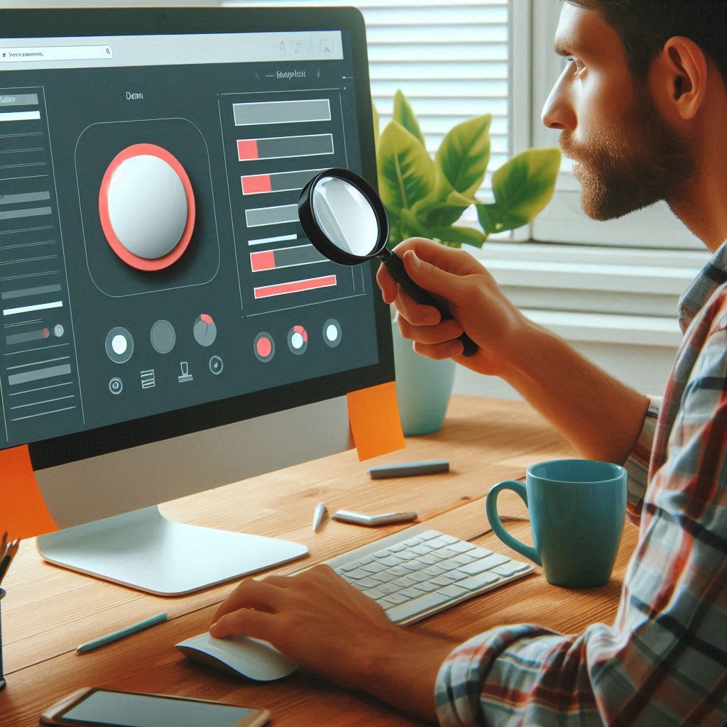
Why You Should Focus on Microinteractions in Web Design
In the realm of web design, every detail counts, and one aspect that often goes unnoticed yet plays a pivotal role in enhancing user experience is microinteractions. These subtle animations and interactions are small, but they contribute significantly to how users engage with a website. In this blog, we will explore what microinteractions are, their importance in web design, and how you can effectively incorporate them into your projects.
What Are Microinteractions?
Microinteractions are contained product moments that revolve around a single use case. They are small, specific animations or design elements that respond to user actions, providing feedback or enhancing the interaction. Examples include:
- A button that changes color when hovered over.
- A loading spinner while a page is loading.
- A notification that appears when a user successfully submits a form.
These interactions may seem minor, but they play a crucial role in guiding users, providing feedback, and improving the overall experience on your website.
The Importance of Microinteractions in Web Design
- Enhanced User Experience: Microinteractions enhance the overall user experience by providing feedback on user actions. For example, when a user submits a form and receives a confirmation message, it reassures them that their action was successful.
- Improved Engagement: Users are more likely to engage with a website that offers interactive elements. Microinteractions can make an interface feel more alive, encouraging users to explore further and interact more.
- Guiding User Actions: Microinteractions can guide users on how to navigate your site effectively. For instance, highlighting a button on hover or showing a tooltip can direct users on what to do next.
- Brand Personality: Incorporating unique microinteractions can convey your brand’s personality. Whether it’s playful, professional, or innovative, these small details can reinforce your brand identity.
- Error Prevention: Microinteractions can help prevent user errors. For instance, displaying an error message when a user inputs incorrect information in a form can guide them to correct their mistake.
- Increased Accessibility: Thoughtful microinteractions can enhance accessibility. For example, animations can help visually impaired users understand when an action has been completed or if an error has occurred.
Examples of Effective Microinteractions
- Button Hover Effects: A button that slightly enlarges or changes color when hovered over can draw attention and indicate interactivity.
- Form Validation: Real-time validation of form fields, with immediate visual feedback (like a green checkmark for correct inputs), improves usability.
- Notification Banners: Subtle animations for notification banners that slide in from the top or bottom can effectively alert users to updates without being intrusive.
- Progress Indicators: When users are uploading files or processing data, a progress bar or spinner can reassure them that the action is being completed.
- Animated Icons: Icons that animate on click or hover can provide a more engaging experience, making the interface feel dynamic and responsive.
Best Practices for Implementing Microinteractions
- Keep It Subtle: Microinteractions should enhance the experience without overwhelming the user. Aim for subtle animations that complement the design rather than distract from it.
- Focus on Feedback: Ensure that microinteractions provide clear feedback for user actions. Users should instantly understand what their interaction means.
- Consistency: Maintain consistency in your microinteractions across the website. This helps users predict how elements will behave, enhancing usability.
- Use Animation Sparingly: While animations can enhance the experience, overusing them can lead to a cluttered interface. Use animations only where they add value.
- Consider Accessibility: Ensure that microinteractions are accessible to all users, including those with disabilities. Provide alternative text for screen readers and consider how animations will be perceived by users with visual impairments.
- Test with Users: Conduct usability testing to see how real users interact with your microinteractions. Their feedback can provide insights into what works and what doesn’t.
Conclusion
Microinteractions are not just design embellishments; they are essential components of user experience that can significantly impact how users interact with your website. By focusing on these small but powerful interactions, you can create a more engaging, intuitive, and satisfying experience for your users.
As web design continues to evolve, embracing the significance of microinteractions can set your projects apart. So, whether you’re designing a new website or revamping an existing one, don’t overlook the power of microinteractions in creating a captivating user experience.


